The importance of data visualization in assessing progress in self-acquired skills
Understanding Data Visualization
In today’s fast-paced world, data visualization has emerged as a crucial tool for individuals seeking to gauge their self-acquired skills. With so much information at our fingertips, transforming raw data into visual insights can significantly enhance understanding and progress tracking. Instead of dealing with overwhelming spreadsheets filled with numbers, visualizations such as graphs, charts, and infographics provide a clear, accessible way to comprehend complex information and trends.
The Growing Need for Clarity
Many people pursue personal development in various areas such as:
- Programming languages
- Artistic skills
- Public speaking
Yet, measuring progress in these domains can be challenging without visual aids. Imagine a budding programmer who has just learned a new coding language. Tracking projects completed, concepts mastered, or even debugging errors visually through timelines or completion bars can offer tangible indications of significant milestones achieved.
Similarly, an artist might find it inspiring to visualize their artistic journey through a digital portfolio showcasing their previous works alongside skills acquired over time. Public speakers can benefit from tracking practice sessions or audience engagement metrics in the form of charts, providing clear measurements of their improvement and areas that still require focus. This is where data visualization plays a vital role in not just recording achievements but also motivating continuous growth.
Benefits of Data Visualization
Utilizing data visualization enhances learning through:
- Clear representation of progress benchmarks
- Identification of strengths and weaknesses
- Improved retention of information
Visuals serve as cognitive shortcuts, allowing learners to grasp essential information at a glance. By converting complex data into engaging visuals, learners can foster a deeper understanding of their journey and identify areas needing improvement. For example, a learner might use a pie chart to represent the percentage of time spent on different subjects, emphasizing the balance needed to ensure skills are evenly honed.
As technology continues to evolve, the significance of data visualization in personal growth is undeniable. Tools like Tableau, Google Data Studio, and even Excel offer user-friendly interfaces that enable individuals to create customized visuals tailored to their personal development goals. The integration of these tools in personal learning practices promotes a culture of self-assessment and refines strategies for achieving ambitions. Overall, the compelling nature of data visualization not only transforms data into insight but inspires action towards continual self-improvement.
DISCOVER MORE: Click here for additional insights
Transforming Raw Data into Actionable Insights
In the realm of personal development, the journey toward mastering new skills can often feel overwhelming. The emergence of data visualization has revolutionized how individuals interact with their progress information, enabling a more systematic approach to self-assessment. By converting numerical data into visual context, learners can glean insights that might otherwise go unnoticed in a sea of statistics. Each bar chart, line graph, or heat map not only serves as a record of what has been accomplished but also acts as a motivational tool that pushes learners forward.
The Role of Visuals in Skill Assessment
Consider the experience of a musician honing their craft. Tracking progress can encompass various elements, such as the number of songs performed, hours of practice, or genres mastered. By creating a visual representation of these metrics—perhaps a series of layered graphs—musicians can quickly identify patterns in their practice habits, allowing for more targeted improvements. This can be particularly beneficial in competitive environments, where understanding the nuances of one’s performance can mean the difference between success and mediocrity.
Data visualization extends beyond artistic endeavors and into the fields of technology, business, and even personal wellness. For instance, an aspiring software developer can establish a visual dashboard that captures key coding milestones, such as:
- Number of coding challenges completed
- Technologies learned
- Time spent debugging
This visual tracking provides immediate feedback, encouraging the learner to maintain a consistent study schedule and recognize pivotal moments of growth. The ability to see progress in a visually engaging format can also ignite a passion for continued learning, fostering a sense of accomplishment that reinforces the ongoing development of self-acquired skills.
Improving Decision-Making Through Visualization
In addition to enhancing understanding and motivation, data visualization can inform better decision-making. When faced with the choice of which skills to prioritize, visual insights can reveal critical areas that require more attention. For example, an individual determined to become a public speaker might analyze audience feedback scores and compare them against practice session frequency through a scatter plot. This allows for a clear assessment of whether increased practice correlates with improved performance, enabling learners to tweak their strategies accordingly. Through this iterative process, personal development becomes less daunting and more structured.
The implications of data visualization extend far beyond mere record-keeping. It bridges the gap between insight and action, ensuring that individuals not only recognize their growth but are also empowered to redirect their efforts when progress stalls. By integrating data visualization into personal development practices, learners acquire the tools necessary for a more engaged, informed, and successful journey toward mastering self-acquired skills.
| Advantages | Impact |
|---|---|
| Enhanced Clarity | Visual representations simplify complex data, enabling easier comprehension of progress in skills. |
| Engagement and Motivation | Dynamic charts and graphs can motivate learners by showcasing their progress and achievements visually. |
| Identifying Trends | Data visualization helps in recognizing patterns and trends, guiding future learning efforts for self-improvement. |
| Better Decision-Making | Visual tools aid learners in making informed decisions regarding their skill development strategies. |
The significance of data visualization in assessing the progress of self-acquired skills cannot be overstated. With the ability to convert complex sets of data into visual formats, learners can extract valuable insights quickly. A well-designed visualization serves as a powerful tool to track performance metrics, revealing areas that require more focus or refinement. This proactive approach not only enhances the efficiency of learning but also fosters a sense of accomplishment as learners visually monitor their advancements. In a world where information overload is common, simplifying this data through visual means becomes essential for effective personal skill development. Ultimately, harnessing the power of data visualization empowers individuals to take charge of their learning journey, making it a critical component in today’s educational landscape.
DIVE DEEPER: Click here to uncover more insights
Enhancing Reflection and Learning through Visualization
Reflection is a vital component of the learning process. It encourages individuals to think critically about their experiences and extract lessons that will pave the way for future growth. Here, data visualization serves as a powerful ally, facilitating a clearer understanding of one’s learning trajectory. For instance, a graphic timeline showcasing major milestones in learning a new language can reveal the relationship between dedicated study hours and fluency levels. This visual aid not only spotlights successes but also highlights periods of stagnation, enabling individuals to reassess their strategies.
Facilitating Community Learning through Shared Visuals
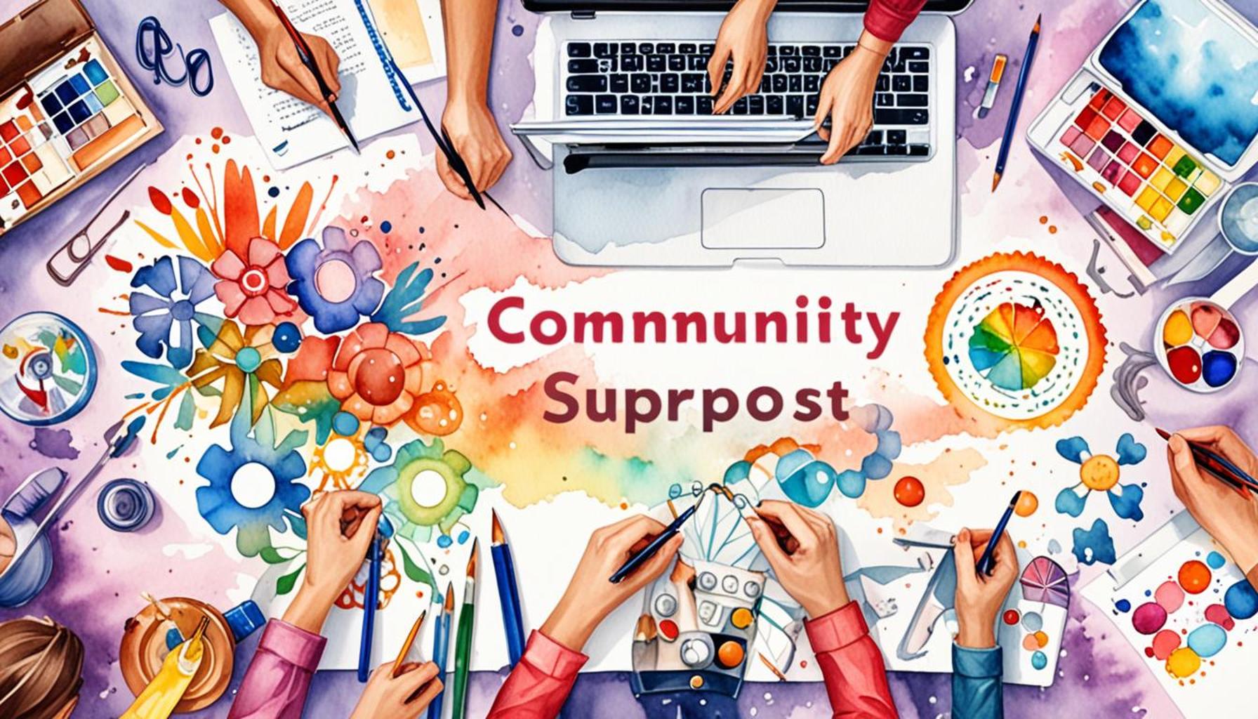
As more people embark on self-directed learning journeys, the opportunity for community learning emerges. Sharing visual progress reports can create a culture of collaboration among skill developers. Platforms like GitHub allow programmers to publish their coding progress visually while contributing to open-source projects, fostering collective knowledge sharing. Similarly, artists can form networks where they showcase progress charts related to mastering various techniques or styles. This sense of community can heighten motivation and encourage accountability, showcasing how visual data acts as a catalyst for communal engagement in personal growth.
The potential for visual data sharing extends into educational settings as well. Educators can leverage data visualization tools to present collective class progress, providing students with a roadmap to identify strengths and tackle weaknesses together. For instance, utilizing a progress heat map to indicate areas of difficulty in mathematics can motivate students to explore these challenges as a group, breaking down barriers to understanding through cooperative learning.
Utilizing Technology for Personalized Data Insights
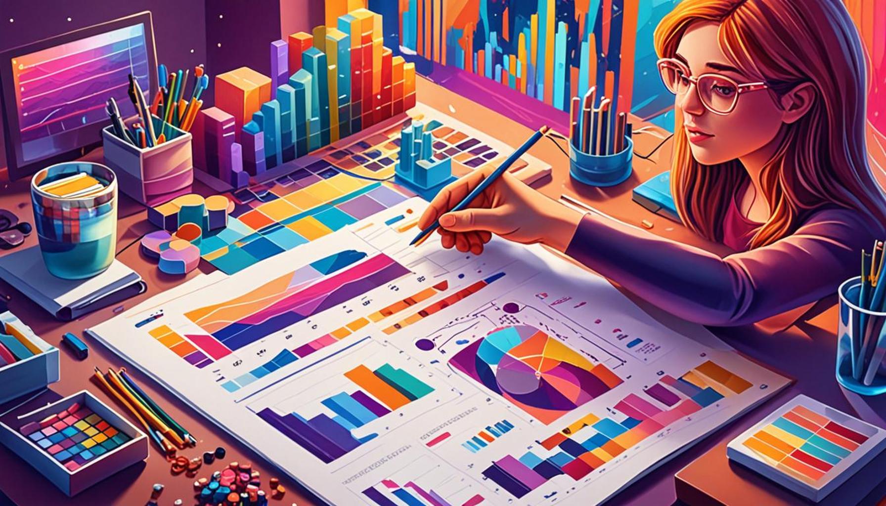
Advancements in technology mean that individuals can now access a plethora of apps and software that specialize in data visualization for personal development. Tools like Tableau, Microsoft Power BI, and even dedicated apps such as Notion or Trello incorporate features that lend themselves to effective skill tracking. These platforms allow skill developers to customize their visuals based on their unique goals and milestones. For example, a fitness enthusiast could visualize their training regimen and dietary choices through graphs that plot workout duration and caloric intake against performance metrics over time. Such personalized insights not only raise awareness but also enhance accountability, propelling the individual toward their desired objectives.
Moreover, by incorporating elements like color-coded performance metrics or trend indicators, users are equipped to recognize not only when they excel but also when adjustments are necessary. This adaptability allows learners to maintain flexible learning paths, evolving their strategies as they develop new insights.
The Power of Storytelling through Data Visuals
Finally, one of the most compelling aspects of data visualization in skill assessment is its inherent storytelling capability. Each visual represents a chapter in an individual’s growth, illustrating how previous experiences built the foundation for current competency. The progression from novice to expert becomes a narrative enriched by visual cues—data points and trends that collectively embody effort, resilience, and transformation.
For example, a digital portfolio showcasing an artist’s evolving style using a series of visual timelines can evoke readers’ emotions, drawing them into the creator’s journey. Similarly, a software developer can tell their story through skill badges earned on a platform, inviting potential employers to witness their growth over time, thus showcasing not only their ability but their dedication to life-long learning.
In sum, the interplay between data visualization and self-acquired skill assessment unlocks avenues for reflection, community engagement, personalized insights, and compelling storytelling. By harnessing these elements, individuals can undertake a more informed and motivated approach to their personal development journeys.
DIVE DEEPER: Click here to learn more about effective learning techniques
Conclusion: Elevating the Self-Acquisition Journey through Data Visualization
In today’s fast-paced world where personal development and skill acquisition are paramount, data visualization emerges as an indispensable tool for assessing progress and enhancing learning experiences. As explored throughout the article, visualizing data not only enables individuals to track their journey effectively but also offers insights that foster critical reflection and informed decision-making. This multifaceted approach allows learners to recognize their strengths, identify areas for improvement, and adapt strategies accordingly, creating a dynamic feedback loop in their development process.
Moreover, the shared aspect of data visualization cultivates community learning, encouraging collaboration and accountability among aspiring skill developers. Platforms that facilitate the sharing of visualized progress not only enhance motivation but also create a collective pool of insights, driving everyone towards shared goals. Leveraging technology further personalizes this journey, allowing individuals to tailor their visual tools to fit their unique objectives and milestones.
Ultimately, integrating data visualization into the process of assessing self-acquired skills reveals deeper narratives about each learner’s growth. By transforming raw data into compelling visuals, learners engage in a storytelling experience that encapsulates their efforts, challenges, and triumphs. As you embark on your own self-directed skill development journey, consider adopting data visualization practices to amplify your learning outcomes. The potential for deeper understanding and community engagement is boundless, paving the way for a brighter future in personal growth and lifelong education.